With something like over 3 million apps between the Google Play and Apple App Stores today, it’s becoming ever more difficult to differentiate your apps and entice downloads. Thankfully, adding in an App Store video to your app’s listing page is an excellent way to increase your conversion rates and increase the quality of your installing users.
Why? Well, as is the case with digital marketing in general, video works. Notice that your Facebook feed is now clogged with videos? Did you see that Instagram just increased their max allowed video length to 60 seconds? Have you seen your kid’s Snapchat or Vine stream? Video dominates mobile and internet, because the barriers to absorbing information are lower than with other mediums.
People browsing app stores are lazy. It’s not their life’s mission to hunt down the best apps.
But watching a video with a snappy, engaging, exciting preview of what using your app is like will obviously increase the likelihood of download. It also means that users who install after playing the video are much less likely to uninstall the app, because users will feel they are making a more informed decision when they hit the “download” button.
But you will not see these benefits just by putting any ol’ video to go along with your app. (Although, just having a video will improve your ASO-App Store Optimization- ranking.)
On the contrary, the opposite is true: an app store video that does not engage your users or match their expectations will significantly decrease your conversion rates, by getting users who would otherwise have installed to watch the video and then drop off.
Bottom line: designing a stellar app store video should be an app marketer’s goal, and understanding where your video falls short is crucial.
Engagement levels with App Preview Videos
To start, let’s look at some benchmarks for video engagement across the two main app stores:
Video Plays
- An average of 15% of Google Play visitors play the video
- An average of 7.5% of iOS App Store visitors play the video
Video Completion
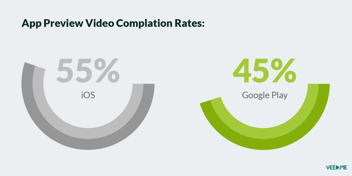
Of those users who begin your app store video, 55% will watch until the end on iOS. Only 45% finish your video on Google Play.
After Watching
Users who watch your videos do the following
- 50% of users scroll the gallery in iOS. 25% do so in Google Play
- 70-80% of users on both platforms will scroll down the page looking for more content
- 5% of users on both platforms read the description
- 20% of users will not have any other page interaction, and will make the decision of whether or not they want to install after completing the video
Ok, so how much can a video lift conversions to download?
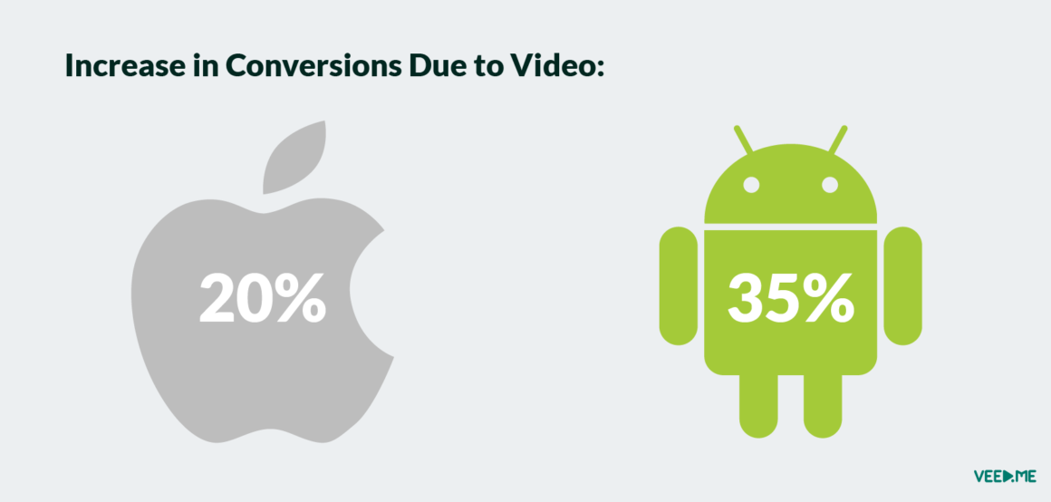
Even if a majority of app store visitors are so lazy that they’ll never even get to your video, it’s still possible to lift conversions with a good video. According to StoreMaven’s A/B tests of apps with App Preview videos and those without, it’s possible to increase conversions by 20% in the Apple App Store and by 35% on Google Play.
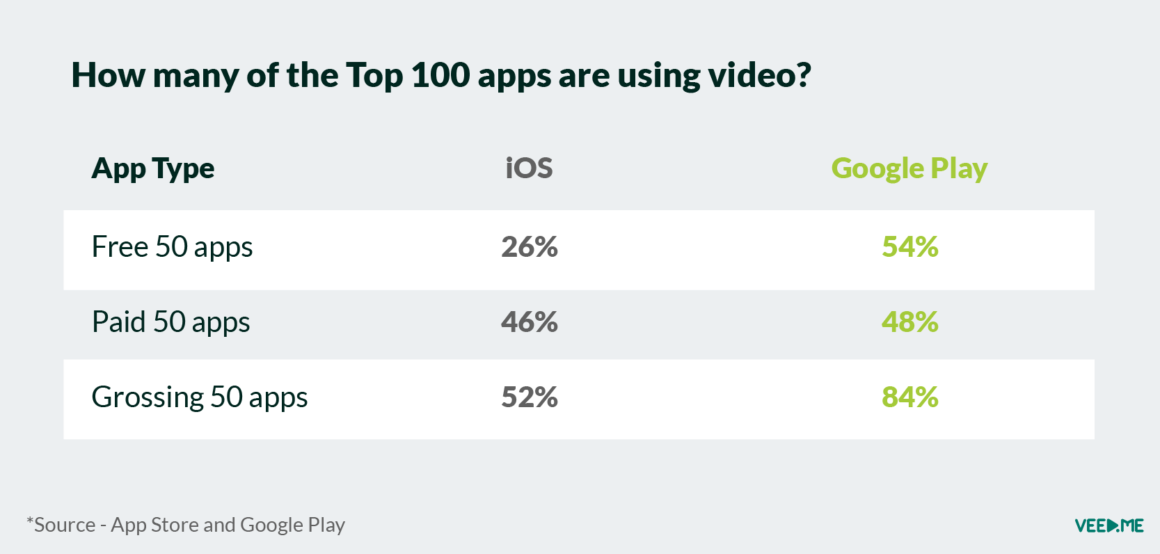
How many of the Top 100 apps are using video?
It’s interesting to note that over half of the top 50 grossing apps in iOS and 84% of the top 50 grossing apps in the Android Play store are utilizing app store videos.
How can I optimize my App Store Video?
There are many elements you need to get right and optimize in order to have a cohesive, engaging App Store video.
Poster Frame
While Apple and Google each have different requirements in terms of length and format for videos (more on that later), it’s important in both that you have an engaging, “clickable” thumbnail image for your video.
In the iOS App Store, the thumbnail image MUST be a frame from your video, and it also serves as your first image in the App store, which 100% of your users will see. Therefore it must stand on its own as an exciting, explanatory image as well as being a frame from the video, which can be tricky sometimes. You also need to make sure that your first two screenshots are not repetitive, as it will decrease the chances that the browser will keep flipping through the rest of the images.
In the Google Play store, you have more freedom, as the thumbnail image to the video does not have to be from the video, and it appears above the separate section of screenshots of the app.
Length
Here
For Google Play, the suggested length is between 30 seconds and 2 minutes, and you can do whatever type of content you like. Many app marketers will repurpose another video they may have had on YouTube or for other broad branding purposes. We think it’s better to focus on your actual app in the video.
In general, the shorter the better, as drop rates increase substantially after the first 5 seconds.
Order
It’s important to get the balance right between highlighting your brand assets (name, logo, jingle, etc) and the app functionality or experience itself. You can A/B test different versions of your App Preview to better understand when is the best time to show your
Sound
Facebook, Instagram
call outs
that highlight key information that works without the sound on.
On the other hand, it’s equally important to choose a nice audio track to go along with the video messaging for those users who do view your app store video with sound. Music should accompany the content carefully. For example, you should use sound effects when showing specific app actions, so that users get a concrete feel of your different features. So, when a button is clicked, you should add a unique sound effect for that action.
Lastly, using a good voiceover to explain your app in a step-by-step manner can also be a good way to keep attention during your video. But tone and gender of your voice-over narrator may impact your users, so be sure to test out a few different options!
Localization
Does your app support multiple languages? Google Play allows you to link to a different video for each of the 47 languages it supports—including English, Japanese, and Zulu—making it easier to promote to international users. (Another tip: if you don’t have multiple translated YouTube videos, but have different language transcripts on your video, Google Play will automatically show the correct transcript).
Industry Specific Tips
While all the above advice is applicable for app store videos as a whole, it’s also important to keep in mind your app vertical and the type of video content that will resonate most with your audience. Here are some industry specific tips:
Gaming App Preview Video
A gaming app preview video should not focus too heavily on “brand” scenes with logo, music, etc, but rather show actual “game play” and why the game is exciting and different. There’s not enough time to focus on characters, UI, or how to use the game, so use your precious seconds on showing the actual game in all its glory. Here is a good example, other than too many logos upfront. If you’re already successful, you can experiment with more unique formats, like this amazing one with Liam Neeson for Clash of Clans.
Utility App Preview Video
It’s easy to fall into the trap of making your utility app preview video a tutorial on how to use or the UI. Instead, you should focus less on UI and show the
Fashion/ E-Commerce App Preview Video
Fashion apps naturally appeal to the highly image-conscious, so showing actual people wearing fashion items instead of just showing the items themselves will help bring your video to life. Since
Summing up
If you didn’t have time to read through every step of how to make a good app store video, if nothing else please keep these guidelines in mind:
- Focus on the first 5 seconds, they are the most important ones to grab attention
- Transition between screens with captions / callouts
- Don’t rely on narration alone to explain the app
- Diversify the screenshots gallery; don’t repeat the screenshots in a video format
- Don’t focus on explaining how to use the app – show the value and experience instead
- Keep it short – up to 30 seconds
- Develop unique videos for iOS and Google Play as each have different requirements
This post was written in conjunction with our friends at StoreMaven, who provided much of the data you see here. StoreMaven is an A/B Testing platform for optimizing your App Store creative.
Need an App Store Preview Video?


